Using the Color Wheel for Wood Tones

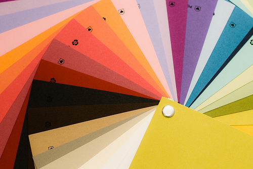
When choosing colors for a room, it can be helpful to assess the overall color of the wood tones within the room, so that you can create a more visually pleasing color palette. Although people sometimes don't think that wood colors factor heavily into the to paint color selection process, a room will look more coordinated if you choose warm paint colors for rooms that have warm wood tones, and cool paint colors to match cool wood tones. Since this can sometimes be difficult for somebody who is inexperienced in color matching to do on their own, using a color wheel can be a big help.
All text copyright Maria Harris. Photo from Flikr - "2.26.09: color wheel" courtesy of Team Dalog.
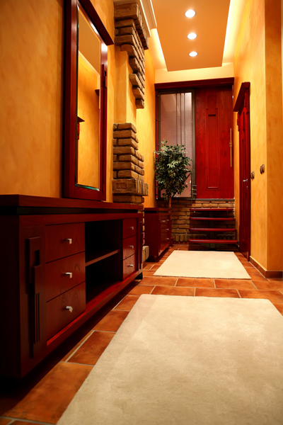
Natural Colors of Various Woods
Wood shades not only vary in regards to warm and cool shades, but also in regards to lightness and darkness. The amount of contrast between the color of the wood and the surrounding painted wall areas can create either a high or a low color contrast. Although both of these effects can be used to your advantage when decorating a room, there are some guidelines you can follow to create the best effects. For example, if you have dark finished woodwork in your home, light wall shades often look best because of the visual contrast. Before choosing a color, use a color wheel to determine if your woodwork is a warm or a cool shade, and what color undertones exist in the wood. This will allow you to choose a light shade that will complement the darker wood trim, creating not only a nice visual contrast as far as depth of color goes, but it will also help keep the colors complementary. If your woodwork is a medium shade, you will be able to use darker or lighter wall colors, depending on your preference, while still maintaining a nice level of contrast. Light colored woodwork often looks attractive contrasted against darker wall shades.
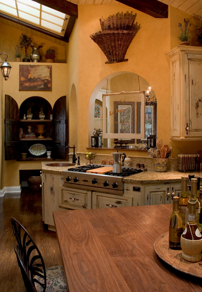
Coordinating Wall Color with Wood Furniture Tones
If you have a lot of dark colored wood furniture in the room, you will need to decide if you would like the furniture to stand out visually, or blend in with the walls. Using a light colored wall finish in a room with dark wood furniture is a great way of highlighting the architectural details of your furniture, but this method does tend to make the room seem smaller and visually "busier." Using mid to dark shades of wall colors with dark wood furniture will allow the furniture to blend in with the walls, which will make the walls appear to move further back, creating the illusion of more space.
Bringing Out Color Tones of the Wood with Paint
You can also bring out the highlights of your wood trim and furniture by using a color wheel to pick up the undertones. For example, if you have wood trim in a warm pine color, you could either enhance or detract from the wood's yellow undertones, depending on the wall color chosen. Green shades would complement the yellow undertones, while shades of blue would create contrast. Yellow and orange shades would be complementary, but would probably not provide enough contrast for the best visual effect.
While choosing wall colors to complement the wood tones in a room is not as easy as choosing the perfect abstract wall art or tropical wall decorations, it can be skillfully done with a little planning and the aid of a color wheel.
This article is written by Maria Harris, who writes for Metal Wall Art.


